


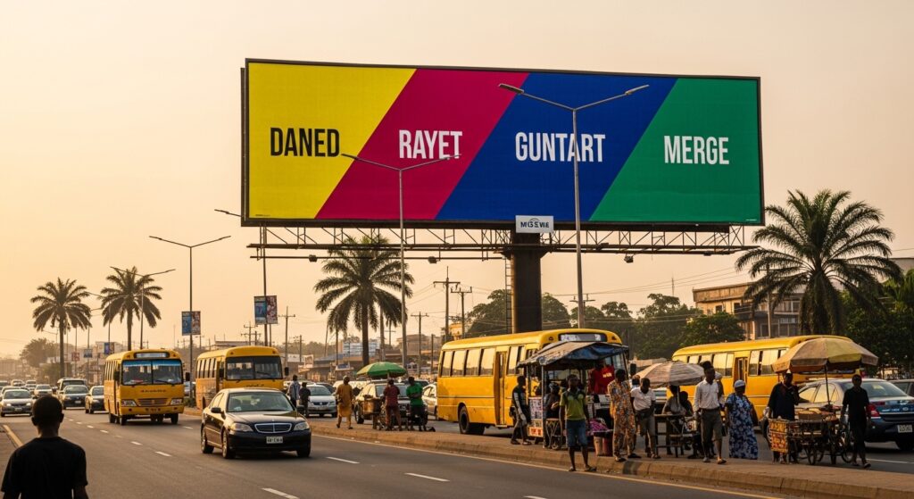
Colour choice determines whether a billboard captures attention or fades into background noise. Nigerian roads present dense visual environments filled with traffic, signage, storefronts, and sunlight glare. Designers must choose colours that cut through that clutter and remain readable at speed and distance.
This guide explains which colours perform best on Nigerian billboards, why they work, and how to apply them for maximum visibility, recall, and response.
Why Colour Matters More for Nigerian Billboards
Colour drives first notice. Drivers often see a billboard for only a few seconds while navigating traffic in cities such as Lagos. A strong palette allows the message to register before the viewer looks away.
Nigeria’s outdoor environment amplifies the importance of contrast and brightness. Harsh sunlight washes out weak colours. Dust haze reduces clarity. Competing visual noise demands aggressive colour separation.
Effective billboard colours must therefore achieve three goals:
-
Grab attention at a glance
-
Stay readable under strong daylight
-
Maintain emotional clarity across distance
When colour fails on any of these fronts, the campaign loses impact regardless of creative quality.
Which Colours Attract the Most Attention on Nigerian Roads?
High-visibility colours share one trait. They create a strong contrast against both sky and urban surroundings.
Top-performing billboard colours
| Colour | Why it stands out | Best use case |
|---|---|---|
| Yellow | Extremely bright and visible in sunlight | Promotions, retail, call-to-action text |
| Red | Signals urgency and emotion instantly | Sales campaigns, food brands, announcements |
| Orange | Combines warmth and visibility | Youth brands, telecoms, and entertainment |
| White | Provides a strong contrast when paired correctly | Background for bold typography |
| Black | Creates maximum readability with bright accents | Luxury brands, premium messaging |
| Blue | Works well for trust and corporate identity | Finance, banking, insurance |
Yellow and red often outperform other colours because they trigger quick visual recognition. Human vision detects these hues faster than cooler tones, especially from peripheral angles.
Bright colours attract attention. High contrast keeps it.
How Sunlight and Weather Affect Billboard Colour Visibility
Nigeria’s climate shapes how colours behave outdoors. Strong equatorial sunlight increases brightness yet reduces subtle tonal differences. Pale colours often appear faded during peak afternoon hours.
Dust and humidity also influence perception. Fine airborne particles scatter light, softening colour edges and lowering contrast. Designers must compensate by increasing saturation and using bold pairings.
Practical adjustments for Nigerian conditions
-
Choose saturated tones instead of pastel shades
-
Use thick lettering with strong colour separation
-
Avoid light text on bright sky backgrounds
-
Test visibility at noon rather than in the evening
Billboards that look balanced on a computer screen often fail outdoors. Real-world lighting should guide final colour decisions.
What Colour Combinations Work Best for Readability?
Single colours rarely determine performance. Combinations decide readability and message clarity.
High-performing billboard palettes rely on strong foreground and background separation. Viewers must decode the message instantly without effort.
Proven high-contrast combinations
| Background | Text colour | Why it works |
|---|---|---|
| Yellow | Black | Extremely readable at a long distance |
| Red | White | High emotional intensity and clarity |
| Blue | White | Clean corporate appearance with strong contrast |
| Black | Yellow | Dramatic and highly visible |
| White | Red | Simple, bold, and easy to scan |
Avoid low-contrast combinations such as:
-
Blue on green
-
Red on black
-
Yellow on white
-
Grey on any bright background
These pairings reduce legibility and slow comprehension.
Speed matters. Drivers cannot decode subtle colour differences.
Do Bright Colours Always Perform Better Than Dark Ones?
Bright colours grab attention faster, yet dark palettes can outperform them when used strategically. The decision depends on the campaign goal and the environment.
Bright palettes dominate busy commercial roads filled with competing ads. They win in crowded areas because they interrupt visual flow.
Dark palettes succeed when:
-
The billboard targets a premium audience
-
The design uses strong lighting or reflective materials
-
The surrounding environment contains many bright colours
Luxury brands often use black backgrounds with gold or white typography. This approach signals exclusivity while remaining readable.
Brightness attracts. Contrast sustains attention.
Which Colours Trigger the Strongest Emotional Response in Nigeria?
Colour psychology affects how audiences interpret billboard messages. Cultural context influences emotional reactions.
Emotional associations commonly observed in Nigerian advertising
| Colour | Typical perception | Common industries |
|---|---|---|
| Red | Energy, urgency, celebration | Food, telecoms, promotions |
| Green | Growth, prosperity, national identity | Agriculture, fintech, sustainability |
| Blue | Stability, trust, professionalism | Banks, insurance firms, tech |
| Yellow | Optimism, affordability, accessibility | Retail, supermarkets, FMCG |
| Purple | Prestige and sophistication | Beauty, fashion, luxury goods |
Green holds special cultural relevance because of its link to the Nigerian flag and national symbolism. Brands often use green to reinforce local identity or trust.
Emotion strengthens recall. Recall drives action.
How Distance Influences Colour Choice on Billboards
Colour performance changes with viewing distance. What looks vivid up close may blur into noise from 100 meters away.
Long-distance readability requires:
-
Strong tonal contrast
-
Minimal colour complexity
-
Large colour blocks instead of gradients
Gradients reduce clarity because subtle transitions disappear at a distance. Solid backgrounds maintain visual strength.
Distance-based colour strategy
| Viewing distance | Recommended colour approach |
|---|---|
| Under 30 meters | Slightly more colour detail allowed |
| 30 to 80 meters | Strong contrast required |
| 80+ meters | Use bold primary colours only |
Designers should evaluate colours using a zoomed-out preview that mimics roadside viewing. If the message disappears at a small scale, the palette needs adjustment.
Do Digital LED Billboards Require Different Colours?
Digital billboards behave differently from printed ones. LED screens emit light, while static billboards reflect it.
LED displays can show brighter colours at night but may oversaturate during the daytime. Extremely vivid tones sometimes cause glare or pixel bloom.
Best practices for LED billboard colour selection
-
Reduce saturation slightly for daytime campaigns
-
Avoid pure white backgrounds that produce glare
-
Use darker tones for night readability
-
Maintain thick typography for clarity
Motion graphics also change colour perception. Fast transitions reduce reading time, so colours must remain simple and bold.
Digital screens expand creative options. Discipline keeps them effective.
How Many Colours Should a Billboard Use?
Too many colours weaken visual hierarchy. Viewers struggle to identify the main message quickly.
Most effective billboards follow a simple rule.
Ideal colour count
-
One dominant background colour
-
One primary text colour
-
One accent colour for emphasis
Three colours usually suffice. Additional colours should serve a functional role, such as highlighting price or call-to-action.
Complex palettes dilute focus. Simplicity strengthens recall.
What Mistakes Reduce Billboard Colour Effectiveness?
Poor colour decisions often explain why campaigns underperform even in premium locations.
Frequent colour mistakes
-
Using brand colours without testing outdoor visibility
-
Placing light text on bright sky-toned backgrounds
-
Choosing trendy gradients that disappear at a distance
-
Matching billboard colour to surrounding buildings
-
Overusing decorative colour elements
Design must prioritize visibility over aesthetic preference. Outdoor advertising rewards clarity, not subtlety.
How to Choose the Right Billboard Colours for Your Campaign
Effective colour selection follows a structured process rather than guesswork.
Step-by-step method
-
Identify the campaign goal
Awareness campaigns benefit from bright, high-energy colours. Premium messaging often suits darker palettes. -
Study the billboard location
Observe surrounding colours, traffic direction, and sunlight exposure. -
Define the primary message
Select a background that contrasts strongly with the key text. -
Limit the palette
Reduce colours until the message remains clear in a small preview. -
Test in daylight conditions
Simulate harsh brightness to ensure readability holds.
This process prevents subjective decisions from weakening performance.
Quick Reference: Best Billboard Colours in Nigeria
| Campaign goal | Recommended colours |
|---|---|
| Maximum attention | Yellow, red, orange |
| Corporate trust | Blue, white |
| Premium positioning | Black, deep purple |
| Local identity | Green with strong contrast |
| Sales promotion | Red with white or yellow text |
Choose colours based on objective, location, and readability rather than personal taste.
Final Thoughts
Colour determines whether a billboard communicates or disappears. Nigerian outdoor environments demand bold contrast, high saturation, and disciplined palettes. Effective colour selection shortens recognition time, strengthens brand recall, and increases response.
Design choices should always prioritize visibility in real traffic conditions. When colours remain readable under harsh sunlight and long viewing distances, the billboard stands a strong chance of delivering results.