

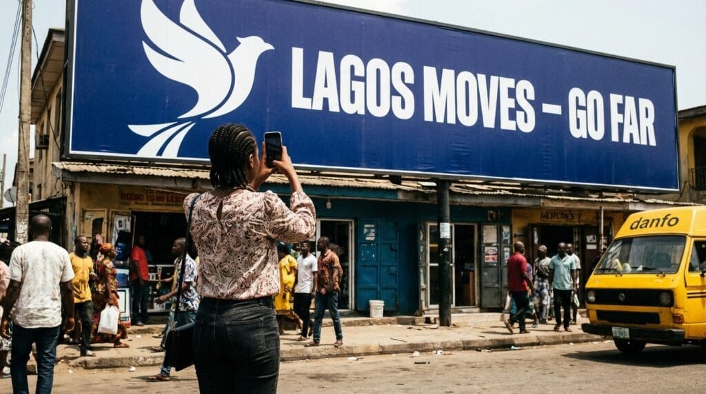
Your billboard is up. Thousands of people are driving past it every day. But nobody is photographing it, nobody is posting it, and the campaign exists only on one road in one city for the duration of the contract.
Meanwhile, a competitor’s billboard is circulating on Twitter, showing up on Instagram feeds, and generating conversations the brand never paid for.
The difference is rarely in the budget. It is almost always designed. Billboards that earn social media attention are built for it from the very first creative decision.
Why Your Billboard Should Be Designed for Two Audiences, Not One
Every billboard has a primary audience: the commuters, drivers, and pedestrians who pass it on the road. That audience is what the media buy is designed to reach.
But in 2026, every billboard also has a potential secondary audience: the people who will see it on a phone screen if someone stops to photograph it and share it online.
That secondary audience costs nothing to reach. It requires no additional media spend, no production budget, and no booking fees. It is pure earned media, triggered entirely by a creative decision made before the artwork was sent to print.
Nigerian social media users, particularly on Instagram, Twitter/X, and WhatsApp, regularly share interesting, funny, bold, or beautiful things they encounter in their physical environment.
A billboard that gives them a reason to stop and photograph it is not just an outdoor advertising asset. It is a piece of content with the potential to travel far beyond its physical location.
Designing for both audiences does not require two different creative approaches. It requires one very deliberate one.
What Makes a Billboard Shareable on Social Media
Before applying specific design principles, it helps to understand what triggers the impulse to photograph and share a billboard in the first place. Nigerian social media users share outdoor advertising when it does at least one of the following:
- Says something surprising, clever, or provocative
- Uses a visual that is beautiful, bold, or visually unusual
- References a cultural moment, a local truth, or a shared Nigerian experience
- Invites participation through a question, a challenge, or a call to action
- Is simply so minimal and clean that it stands apart from the visual noise around it
None of these qualities requires a large budget. They require a clear, creative decision made early. The design principles that follow are built around each of these triggers.
Design Principles for Social Media-Friendly Billboards in Nigeria
Social media shareability is not a separate design brief. It is a layer of intention applied to the same decisions every good billboard design requires: clarity, contrast, simplicity, and brand recognition.
These five principles address each of those decisions through the lens of the double audience.
Lead With One Bold Visual Element
The billboards that get photographed and shared almost always have one thing in common: a single dominant visual element that commands the frame. A face at an unexpected scale. A product shot that fills the entire board. A graphic element so bold and simple it registers instantly.
Multi-element layouts that divide visual attention across the board are less memorable in person and far less photogenic when captured on a smartphone.
A person taking a quick photograph from a moving vehicle or a busy pavement does not have time to compose a careful shot. The billboard has to do the composition work for them.
Design with a single hero element and let everything else support it. The resulting photograph will tell the same story as the billboard itself.
Use Colour That Photographs Well in Nigerian Daylight
Nigerian daylight is intense and direct, which affects how billboard colours photograph on a standard smartphone camera. Certain colour combinations that look strong on a design monitor or in a studio will wash out, oversaturate, or lose contrast when captured outdoors at midday.
Colours that photograph reliably in Nigerian outdoor conditions:
- Deep navy, black, or forest green backgrounds with white or yellow text
- Bold single-colour backgrounds with high-contrast foreground elements
- Brand colours used at full saturation, not muted or pastel variants
Colours to approach with caution:
- Light backgrounds with light-coloured text (disappears in bright light)
- Gradients that flatten when photographed (lose depth on a phone camera)
- Multiple competing colours that create visual noise in a compressed photo frame
Before finalising a colour scheme, view the design scaled down to the size it would appear in a phone photograph from ten metres away. If the message still reads clearly at that scale and in that compression, the colour palette is working.
Keep Copy Short Enough to Read in a Photo
Billboard copy discipline matters for road visibility, but it matters just as much for social shareability. A billboard with seven words or fewer can be read in a shared photograph without the viewer needing to zoom in.
A billboard with twenty words requires effort that most social media users will not make.
The copy rule for social-friendly billboards: if your message cannot be read in a thumbnail, it will not be shared. Write for the reader who has three seconds at road speed and the follower who has two seconds scrolling a feed. Both deserve the same brevity.
Add a Social Hook Without Cluttering the Board

A social hook is a design element that actively invites the billboard’s audience to engage with the campaign online. The most common and effective examples are:
- A campaign hashtag printed in a visible but non-dominant position
- A challenge or question that has a natural social media response
- A partial statement that invites completion (“Tell us yours at…”)
- A brand social handle presented cleanly alongside the logo
The key discipline is placement and scale. A hashtag that competes visually with the headline undermines both. A hashtag placed deliberately in a corner or beneath the logo, at a size that reads on the board but does not dominate it, performs far better because the overall visual hierarchy remains intact.
Not every billboard needs a hashtag. But every billboard that wants social engagement needs at least one element that tells the audience where to take the conversation next.
Make the Brand Immediately Recognisable
Shared billboards that do not clearly communicate the brand generate attention for the creative, not for the advertiser. Earned reach only has commercial value if the audience knows whose campaign it is.
Brand recognition on a social-friendly billboard requires:
- The logo is placed prominently and at a size that is legible in a shared photo
- Brand colours are used consistently, so the visual is attributable even without the logo
- A creative style that connects clearly to the brand’s other campaign touchpoints
A Nigerian bank whose billboard is shared 500 times on Twitter but whose brand identity is unclear in the photograph has generated buzz, not business. Make the brand unmistakable before you make the creative shareable.
Billboard Campaigns That Earned Social Attention in Nigeria
Some of the most shared outdoor campaigns in Nigeria’s recent advertising history have shared common characteristics.
Campaigns by GTBank, MTN, and Guinness Nigeria that gained social traction consistently used bold, minimal creative with a strong single message, a cultural reference point that resonated immediately with Nigerian audiences, and enough visual confidence to stand apart from the cluttered outdoor environment.
The pattern is consistent: simplicity, cultural relevance, and visual boldness are what earn a photograph. Complexity, small text, and visual noise are what guarantee the camera stays in the pocket.
What Most Nigerian Brands Get Wrong About Billboard Shareability
Designing for the client, not the audience: Many billboard campaigns are approved because they satisfy internal stakeholders, not because they have any chance of earning organic attention.
Creative that lists every product feature, includes every brand colour, and tries to communicate every key message simultaneously is not shareable. It is noise.
Confusing busy with bold: A cluttered billboard is not the same as a bold one. The most shared outdoor campaigns in Nigeria and globally are defined by what they left out, not what they included. Restraint is a creative decision, not a compromise.
Adding a hashtag as an afterthought: A hashtag dropped onto a completed billboard layout at the approval stage is not a social strategy. It is a decoration. A genuine social hook is built into the concept from the beginning, with a clear idea of what the brand wants the audience to do with it.
Not considering the photograph frame: A billboard that is visually striking from a moving vehicle may photograph poorly because of its aspect ratio, the surrounding environment, or the angle at which it can be captured. Walk to the location. Take a test photograph. If the board does not look compelling in that photograph, the social audience will never see it.
The Double Audience Framework: Designing for Road and Feed
Bringing all of these principles together, the double audience framework asks one question at every stage of the billboard design process: Does this decision work for both the person passing it on the road and the person seeing a photograph of it on their feed?
Apply it across the key design decisions:
| Design Decision | Road Audience Test | Feed Audience Test |
| Visual hierarchy | Clear at 80 km/h? | Readable in thumbnail? |
| Colour palette | High contrast in daylight? | Photographs without washing out? |
| Copy length | Readable in 5 seconds? | Legible in a shared photo? |
| Brand presence | Logo visible from a distance? | Brand clear in a cropped photo? |
| Social hook | Visible without dominating? | Gives audience somewhere to go? |
A billboard that passes every test in both columns is designed for the full reach its location and its shareability can deliver.
Frequently Asked Questions
Do all billboards need to be designed with social media in mind?
Not all, but most will benefit from it.
What size should a campaign hashtag be on a billboard?
Large enough to read clearly from the pavement or a slow-moving vehicle, but not so large that it competes with the headline.
Can a billboard be both shareable and ARCON-compliant in Nigeria?
Yes. ARCON’s content guidelines govern what can be advertised and how claims are made. They do not restrict the visual boldness, creative minimalism, or social hook elements that make a billboard shareable. Compliance and creativity are not in conflict.
What types of billboards get shared most on social media?
Visually bold billboards, culturally specific to Nigeria, unexpectedly witty, or unusually minimal tend to generate the most organic social sharing.
Conclusion
A billboard that earns social media attention is not an accident. It is the result of a creative decision made early: to design for two audiences simultaneously, with the same level of intentionality applied to the person passing on the road and the person scrolling a feed.
The five principles in this guide do not require a bigger budget or a more complex brief. They require clearer thinking about what the campaign is trying to achieve and who it is trying to reach. One bold visual. Strong colour. Short copy. A deliberate social hook. An unmistakable brand presence.
Apply those five things consistently, and your billboard has a chance of traveling far beyond the road it sits on. Ignore them, and you have an expensive static asset that disappears the moment the contract ends.
READ MORE:
How Billboard Placement Can Complement Other Marketing Channels
7 Budget Allocation Strategies for Billboard Advertising in Nigeria
How LED Billboards Enable Dynamic Messaging in Nigeria
10 Billboard Advertising Trends in Nigeria
How to Prepare a Billboard Advertising Proposal
How to Write an Effective Billboard Advertising Brief in Nigeria