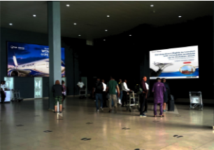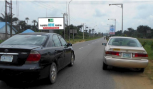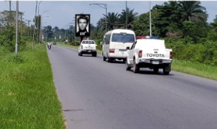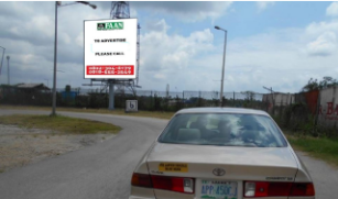


Your billboard is up. The location is perfect, the budget is spent, and drivers are passing it at 80 km/h without reading a single word. The problem is not the location. It’s the font.
Typography is the most underestimated element of outdoor advertising in Nigeria.
Brands spend millions on media space and then undercut their own investment with text that cannot be read at speed, from a distance, or under direct afternoon sun.
This guide tells you exactly what works, what doesn’t, and why it matters more than most designers and marketing managers realise.
Why Your Font Choice Can Make or Break a Billboard Campaign
A billboard is not a flyer. It is not a social media graphic. It is not a magazine ad.
A person viewing your billboard has, on average, between three and seven seconds to absorb your message, while moving, often in traffic, with competing visual stimuli all around them. In that window, your font either communicates instantly or it disappears.
The best fonts for outdoor advertising are not the most stylish or the most creative. They are the most readable, at distance, at speed, and under the lighting conditions of the environment where your billboard actually lives.
How Outdoor Typography Differs from Print and Digital
Typography for billboards operates under completely different rules than typography for websites, brochures, or social media. Understanding this difference is the first step to getting it right.
When designers trained in digital or print apply the same instincts to billboard artwork, the results are consistently poor; text that looks elegant at A4 size becomes impossible to read at 48 sheets.
Viewing Distance Changes Everything
The further a viewer is from your billboard, the more typographic detail disappears. Fine strokes, decorative serifs, tight letter spacing, and thin font weights, all of which may look refined on screen, collapse into visual noise at 30, 50, or 100 metres.
As a general principle:
- Close-range billboards (under 20 metres, e.g., bus shelters or building-mounted boards) – moderate typographic flexibility
- Medium-range billboards (20–50 metres, e.g. standard roadside 48-sheets) – bold, clean fonts only
- Long-range billboards (50 metres and beyond, e.g., highway unipoles and gantries) – maximum weight, maximum simplicity, absolute minimum word count
The further the board, the bolder and simpler your typography must be. There is no middle ground.
Nigerian Road Conditions Add Another Layer
Nigeria’s outdoor environment introduces specific challenges that many font guides, written for temperate, low-glare Western markets, never account for.
Key factors in Nigerian OOH typography:
- Intense sunlight and glare: Nigeria’s intense afternoon sun washes out low-contrast text combinations. Light grey on white, or yellow on cream, becomes invisible outdoors.
- Dust and atmospheric haze: Common in Northern states and during the harmattan season, reducing visual clarity at a distance.
- High-speed expressways: Routes like the Lagos-Ibadan Expressway, Abuja-Kaduna Highway, and the Lekki-Epe Expressway demand fonts that communicate in under five seconds.
- Competing visual clutter: Urban density in Lagos, Onitsha, and Kano means your billboard exists in an environment full of competing signage, shop fronts, and informal advertising.
In these conditions, only the strongest typographic choices survive.
The Best Fonts for Large Outdoor Displays
Font selection for outdoor advertising is not about personal preference or brand aesthetics alone. It is primarily an engineering decision, choosing the letterform that transmits information most efficiently under real-world viewing conditions.
Here is how the main font categories perform on large outdoor displays.
Sans-Serif Fonts: The Gold Standard for Billboards
Sans-serif fonts, those without the small decorative strokes at the ends of letters, are the dominant choice for billboard and OOH advertising worldwide, and for good reason. Their clean, uniform strokes maintain legibility at long distances and in low-contrast environments.
Top-performing sans-serif fonts for outdoor advertising:
| Font | Why It Works Outdoors |
| Helvetica / Helvetica Neue | Neutral, balanced, highly legible at any size. Industry standard globally. |
| Arial | Widely available, clean geometry, performs well at scale. |
| Futura | Strong geometric structure. Bold weights are excellent for headlines. |
| Gill Sans | Slightly humanist feel, strong readability, works across weights. |
| Montserrat | Modern, clean, excellent for brands targeting younger urban audiences. |
| Gotham | High legibility, professional tone, widely used in premium OOH campaigns. |
| DIN | Industrial clarity, excellent at a distance. Popular in transport and infrastructure signage. |
For Nigerian brands, Gotham Bold, Futura Heavy, and Montserrat ExtraBold are particularly strong choices; they project authority and read cleanly against both dark and light backgrounds under direct sunlight.
Serif Fonts: When They Work and When They Don’t
Serif fonts, those with decorative strokes at letter endings, are generally less effective on large outdoor displays. The fine strokes that give serif fonts their elegance in print become liabilities at a distance, where they blur or disappear entirely.
However, there are exceptions:
- Thick-stroke slab serifs (like Rockwell or Clarendon) maintain impact at large sizes because their serifs are bold, not fine.
- Georgia Bold can work on close-range boards with sufficient contrast.
- Traditional serif fonts like Times New Roman, Garamond, or Bodoni should be avoided entirely on billboards.
If your brand identity is built around a serif font, use it in your logo only, and switch to a bold sans-serif for your headline and body text on outdoor executions.
Display and Decorative Fonts: Use with Extreme Caution
Script fonts, handwritten styles, condensed novelty typefaces, and heavily stylised display fonts almost always fail on large outdoor displays.
Avoid:
- Script and cursive fonts: Beautiful on wedding invitations, illegible at 60 km/h
- Ultra-condensed fonts: Letter spacing becomes too tight for distance reading
- Outline-only fonts: The strokes disappear against complex backgrounds
- All-caps decorative fonts: Uppercase-only text already reduces readability; decorative styling makes it worse
The exception: if a decorative element is purely graphic (a logo element, not readable text), it can work alongside clean headline typography.
Font Size Rules for Billboards: What the Numbers Say
Font size on a billboard is not an aesthetic choice; it is a function of viewing distance. The rule most OOH designers use is the 1-inch-per-10-feet standard: for every 10 feet of viewing distance, your letter height should be at least 1 inch at actual print size.
Practical reference for Nigerian billboard formats:
| Billboard Type | Typical Viewing Distance | Minimum Letter Height |
| Bus shelter/street furniture | 3–5 metres | 5–8 cm |
| Standard 48-sheet roadside | 20–40 metres | 25–40 cm |
| Unipole (highway) | 50–100 metres | 60–120 cm |
| Gantry (expressway overhead) | 30–60 metres | 40–75 cm |
When in doubt, go larger. Text that looks oversized in your design software will read perfectly on the road. Text that looks “just right” on screen is almost always too small when printed and mounted.
The Typography Rules Every Billboard Designer Should Follow
Beyond font choice, how you use your font determines whether your billboard communicates. Several typographic decisions, contrast, spacing, and word count, are just as important as the typeface you select.
Contrast Is Non-Negotiable

High contrast between text and background is the single most important factor in billboard readability. Under Nigerian sunlight, low-contrast combinations that look acceptable on screen become invisible on the road.
High-contrast combinations that work:
- Black text on white or yellow background
- White text on black, dark blue, or dark green background
- Yellow text on black or dark navy background
Combinations to avoid:
- Red text on black (low luminance contrast)
- Blue text on green background
- Grey text on white background
- Orange text on yellow background
If you’re running on an LED billboard, test your creative on a calibrated screen at full brightness before approving it. Colours shift significantly between design software and real LED display panels.
Spacing and Letter Kerning
Tight letter spacing reduces legibility at a distance. Open, generous tracking (the space between letters) allows each character to read individually when a viewer has only seconds.
Rules to follow:
- Increase letter tracking by 5–15% beyond default settings for outdoor use
- Avoid justified text blocks, they create uneven spacing that’s harder to read at speed
- Use left-aligned or centred text depending on layout, but never justify long text strings
- Leave a generous space between your text and the edge of the board, a minimum 10% margin on all sides
How Many Words Are Too Many?
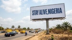
The billboard industry’s most consistent finding is this: fewer words perform better. The ideal billboard conveys a primary message of seven words or fewer.
Word count guide:
- Headline: 3–7 words maximum
- Supporting text (optional): 3–5 words
- Call to action: 1 line, phone number, website, or location only
If you cannot communicate your message in seven words, you are trying to say too much on one board. Break complex messages into a series of billboards along a route, or reconsider whether a billboard is the right format for that message.
What Most Brands in Nigeria Get Wrong About Billboard Typography
After reviewing hundreds of billboard campaigns across Lagos, Abuja, Port Harcourt, and beyond, certain mistakes appear repeatedly.
Using brand fonts designed for digital without adapting them for outdoor. Many brands in Nigeria have stylised logos and custom fonts built for websites and social media.
Always test your font at actual billboard dimensions, not on a laptop screen.
Prioritising style over legibility. Agencies sometimes present beautiful, design-award-worthy billboard concepts that are nearly unreadable from a moving vehicle. The goal of a billboard is not to win design awards. It is to communicate a message to a moving audience.
Mixing too many fonts. A billboard should use one or two fonts maximum, typically a bold display font for the headline and a clean sans-serif for supporting text. Three or more fonts create visual chaos.
Light font weights on coloured backgrounds. Thin or light font weights look elegant in digital contexts but disappear on outdoor displays, especially in Nigeria’s bright daylight conditions. Always use Bold or ExtraBold weights for headline text.
Not testing at scale. The most preventable mistake: approving artwork on a 15-inch monitor and never seeing it printed at actual size before installation. Always request a scaled print proof before final sign-off on a major campaign.
LED Billboards vs Static Billboards: Does Font Choice Change?

Font principles remain largely the same across both formats, but there are important execution differences.
| Factor | Static Billboard | LED Billboard |
| Background | Printed, fixed | Emissive light, colours appear differently |
| Contrast | Relies on ink colour contrast | Light output changes perceived contrast |
| Font weight | Bold minimum | Bold minimum, but thin fonts appear even thinner on LEDs |
| Animation | N/A | Avoid fonts that animate poorly, serif detail flickers |
| Colour rendering | CMYK printing | RGB display, test on the actual screen |
| Night performance | Requires external lighting | Self-lit, lighter font weights become more viable at night only |
For LED billboards, always review your typography on the actual display panel, or at minimum on a monitor calibrated to match the display’s colour profile.
What you see in design software and what appears on a high-brightness outdoor LED screen can be significantly different.
Frequently Asked Questions (FAQ)
What is the best font for billboard advertising in Nigeria?
Bold sans-serif fonts are the most reliable choice.
Should I use uppercase or mixed case on a billboard?
Mixed case (standard sentence case) is generally more readable than all-caps at a distance.
How large should my font be on a billboard?
At minimum, use the 1-inch-per-10-feet rule: for every 10 feet (approximately 3 metres) of viewing distance, your letter height should be at least 1 inch (2.5 cm) at actual print size. When in doubt, go larger.
Can I use my brand’s custom font on a billboard?
Yes, but only if it meets outdoor legibility standards.
How many fonts should I use on a billboard?
One to two fonts maximum. A primary font for your headline and an optional secondary font for supporting text or your call to action.
Does font colour matter as much as font choice?
Yes, equally so. A perfectly chosen font in a low-contrast colour combination will still fail on a billboard.
Conclusion
The font on your billboard is not a decoration. It is a functional tool, one that either delivers your message to a moving audience in under five seconds or doesn’t.
Choosing the right typeface, weight, size, and colour combination is not a minor creative decision. It is one of the most direct levers you have over whether your outdoor campaign actually works.
Brands that treat billboard typography as an afterthought leave results on the road.
Before your next outdoor campaign goes to print, audit your artwork against the principles in this guide. Check your font weight, your contrast ratio, your word count, and your letter spacing. Then test it at actual size, not on a laptop screen.
Great OOH campaigns start with a clear strategy and end with flawless execution. Oxbillboards exists to support both, from helping you find the right billboard locations across Nigeria, to ensuring your campaign is built on a foundation that actually performs.