Your brand has spent years building recognition. A logo people know. Colours that feel familiar. A tone of voice that sounds like you.
Then your billboard goes up and quietly undoes some of that work, not obviously, but consistently enough that the recognition you should be building is not building at all.
Inconsistent billboard design is one of the most common and least discussed problems in Nigerian outdoor advertising. This article is about what it looks like, why it happens, and what it costs.
The Problem Most Nigerian Brands Do Not See Until It Is Too Late
Brand recognition is not built in a single campaign. It is built through repetition, and repetition only works when what is being repeated is consistent.
Every time your audience encounters your brand, whether on a billboard, a social media post, a product package, or a storefront, they are either strengthening an existing mental association or being asked to start a new one.
When your billboard looks different from your other advertising, your audience does not consciously register the inconsistency. They simply do not build the association you are paying for. The billboard reaches them. It just does not reinforce the brand.
For businesses in Nigeria investing significant budgets in outdoor advertising, this is not a minor creative issue. It is a return on investment problem. Every naira spent on a billboard that contradicts your brand identity is a naira that builds less recognition than it should.
The reason this problem persists is that its consequences are invisible and gradual. There is no moment when a brand manager receives a report saying recognition dropped because the billboard used the wrong shade of blue. The damage accumulates silently across campaigns, cities, and years.
What Inconsistent Billboard Design Actually Looks Like in Nigeria
Inconsistency in billboard design takes several forms in the Nigerian market. Understanding what each one looks like is the first step toward recognising it in your own campaigns.
Colour Inconsistency
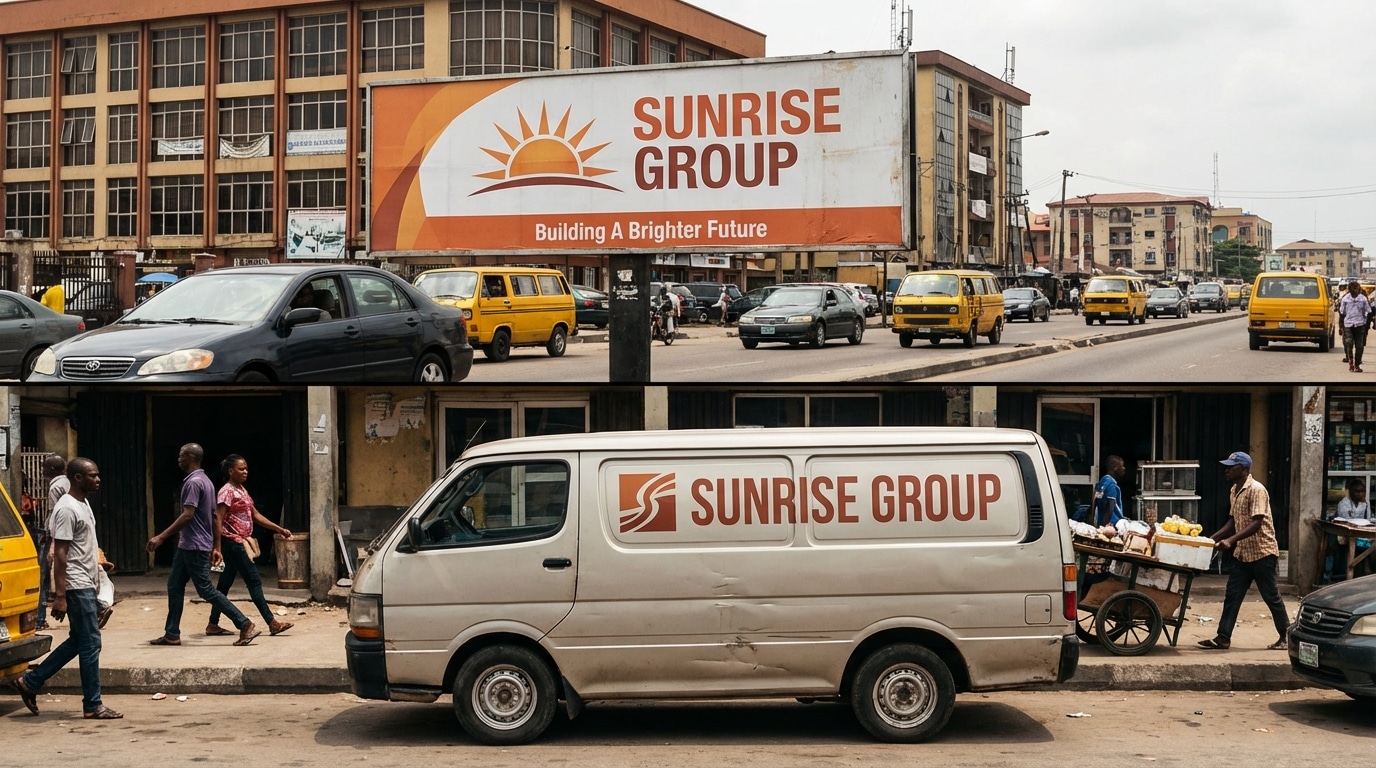
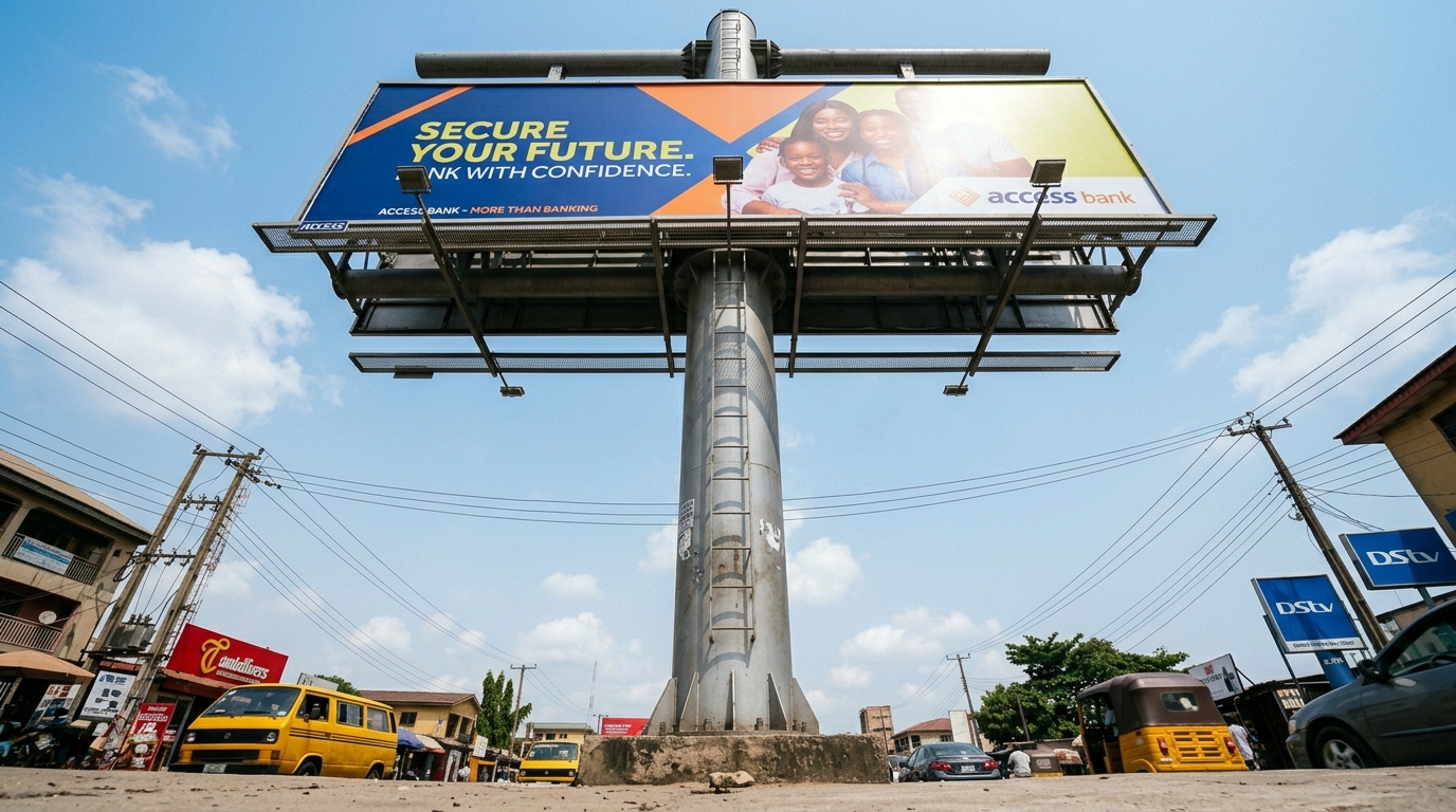
This is the most common and most damaging form of inconsistency. A brand’s official colour is a specific value: a Pantone reference, a CMYK breakdown, an RGB code. When a billboard is printed without calibration against those official values, the colour that appears on the vinyl is an approximation.
In practice, this means a brand whose identity is built around a specific deep green may find their billboard displaying a noticeably different green, either lighter, more yellow, or more blue, depending on the printer’s calibration.
To the casual observer the difference seems minor. To the audience’s subconscious, which has already filed away the correct green as the brand signal, it registers as unfamiliar.
Across multiple billboard locations, printed by different vendors at different times, colour drift compounds. The brand starts to look like several different brands rather than one.
Typography Drift
A brand’s typeface is part of its visual personality. When an agency or designer produces billboard artwork without referencing the brand’s approved typefaces, they typically substitute a font that feels bold and impactful for outdoor use but has no connection to the brand’s established visual language.
The result is a billboard that is legible and visually strong but does not look like the brand. Audiences who encounter the billboard after seeing the brand’s digital or print advertising experience a subtle but real disconnect, a sense that something is slightly off without being able to name what it is.
Disconnected Campaign Concepts
Some Nigerian brands run outdoor campaigns that are conceptually and visually disconnected from everything else they are communicating. The digital campaign has one visual approach. The radio campaign has one tone. The billboard introduces a third creative concept that was developed in isolation, without reference to the broader campaign.
Each medium reaches the audience separately. But because none of them look or sound like the same campaign, the cumulative effect of all that advertising spend is fragmented rather than compounded. The brand is present everywhere and memorable nowhere.
Inconsistency Across Multiple Locations
For brands running multi-city or multi-location billboard campaigns in Nigeria, inconsistency across locations is a specific and significant problem. Different vendors, different printers, different local creative teams, and different approval chains across Lagos, Abuja, Port Harcourt, and secondary cities can produce a campaign where no two boards look exactly the same.
The audience in each city sees a slightly different version of the brand. What should feel like national presence feels instead like a collection of loosely related local campaigns.
Why Inconsistent Billboard Design Happens in Nigeria
Understanding the cause of inconsistency is essential to fixing it. In the Nigerian OOH market, inconsistency almost always traces back to one or more of the following:
No brand guidelines document in the brief
This is the most common root cause. When a designer or agency is briefed without explicit reference to the brand’s official colours, typefaces, and visual standards, they make their own creative decisions. Those decisions may produce strong outdoor creative. They will rarely produce brand-consistent outdoor creative.
Multiple agencies or vendors working without a shared reference
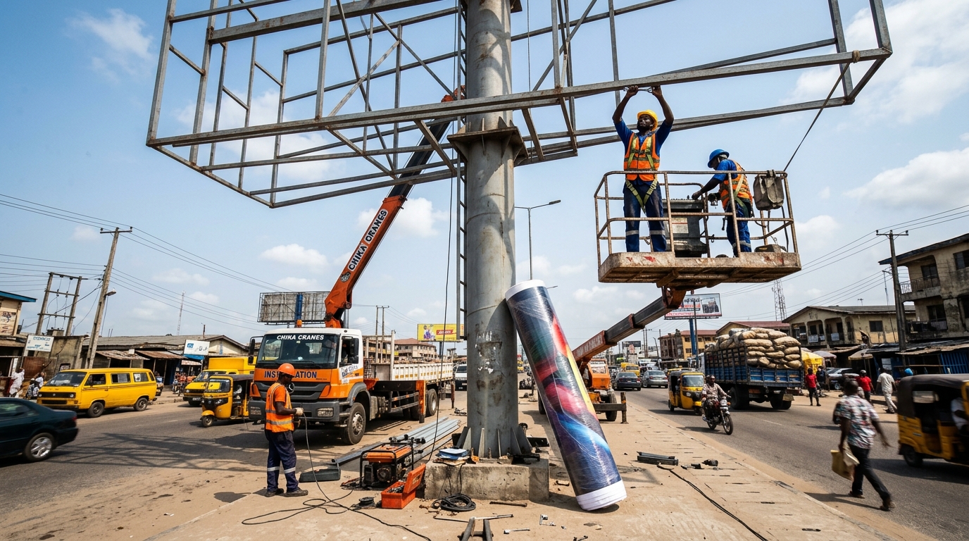
Nigerian brands running campaigns across multiple cities often work with different vendors in each location. Without a centralised creative template and a shared brand reference document distributed to all vendors, each one produces their own interpretation of the brand.
Printer colour calibration not checked before production
Large-format vinyl printing in Nigeria varies significantly in colour accuracy between facilities. Brands that do not request and approve a colour proof before full production begins accept whatever colour the printer produces.
Design decisions made to solve outdoor readability problems without brand authority input
Designers sometimes adjust brand colours or substitute typefaces to solve contrast or legibility problems at outdoor scale. These are legitimate creative problems. But the solutions should be developed within the brand guidelines by someone with brand authority, not resolved independently by the designer or printer.
Time pressure
Rush jobs produce inconsistent creative. When a billboard campaign is briefed and approved under deadline pressure, the careful cross-referencing of every design element against brand standards is usually the first thing dropped.
The Real Commercial Damage Inconsistent Design Does to Nigerian Brands
The consequences of inconsistent billboard design are not dramatic. They are gradual, cumulative, and difficult to attribute directly. That is what makes them dangerous.
Eroded recognition
Audiences build brand recognition through repeated and consistent exposure to the same visual signals.
When those signals vary across touchpoints, the recognition process slows. More exposures are needed to build the same level of recall that a consistent campaign achieves in fewer impressions.
Weakened campaign ROI
A billboard campaign that does not reinforce the brand’s existing identity is delivering less value per impression than it should. The reach is real. The recall is not building at the rate the media spend implies.
Confused audience perception
Nigerian consumers who encounter a brand across multiple inconsistent touchpoints develop a less clear, less confident perception of what the brand stands for. This affects purchase consideration, particularly for brands in competitive categories where trust and familiarity are key decision drivers.
Damaged agency and vendor relationships
When a brand’s marketing team realises that different vendors have produced different versions of their brand identity, the conversation about accountability becomes difficult. Without clear documented standards in the original brief, it is genuinely hard to establish who is responsible for the inconsistency.
How to Audit Your Billboard Creative for Inconsistency

Before briefing your next outdoor campaign, review your last one against these specific checks:
- Pull the artwork files from every billboard location in the campaign and view them side by side. Do the colours match across all locations?
- Compare the billboard typeface against your brand’s approved typeface list. Are they the same?
- Place the billboard artwork next to your most recent digital or print creative. Does the overall visual tone feel like the same brand?
- Check the logo treatment on each board. Is it the correct colour variation, at the correct scale, with the correct clear space?
- Read the billboard headline aloud. Does it sound like your brand’s voice or like a generic advertising copy?
Any element that fails this review is a documented inconsistency. It is also a specific brief requirement for the next campaign.
How to Fix Inconsistent Billboard Design Before Your Next Campaign
Fixing inconsistency does not require a brand redesign. It requires a briefing discipline that most Nigerian brands are not currently applying.
Create or update a billboard-specific brand reference document
This is a one to two page document that specifies your official colour codes in CMYK and Pantone, your approved typefaces and weights for outdoor use, your logo file requirements, minimum size standards, and tone of voice guidelines.
Every agency, designer, and vendor who produces billboard creative for your brand receives this document before briefing begins.
Centralise creative approval
All billboard artwork across all locations should be approved by one person or team with brand authority before going to print. Decentralised approvals, where local teams or vendors self-approve in each city, are the structural cause of multi-location inconsistency.
Request and approve colour proofs before production
For every static billboard campaign, request a printed colour proof from the vendor and check it against your brand colour reference before approving full production. This single step eliminates the majority of colour inconsistency issues.
Build a master campaign template
For multi-location campaigns, brief a single master artwork file that is adapted for each location’s dimensions rather than briefing each location independently. Adaptations should be limited to size and format adjustments. The core visual elements should not change.
Frequently Asked Questions
How do I know if my billboard design is inconsistent with my brand?
Place your billboard artwork side by side with your most recent digital creative and your brand guidelines. Check three things: whether the colours match your official codes, whether the typeface is from your approved list, and whether the overall visual tone feels like the same brand. Any visible difference between the billboard and the guidelines is a documented inconsistency.
Can inconsistent billboard design really affect brand recognition in Nigeria?
Yes. Brand recognition is built through repeated exposure to consistent visual signals.
Who is responsible for ensuring billboard design consistency: the brand or the agency?
Both, but the brand carries primary responsibility. Consistency begins with a clear, specific brief that references brand standards explicitly. An agency cannot be held accountable for inconsistency that was not defined as a requirement in the brief. The brand team must establish and enforce the standard before any creative work begins.
Does inconsistent billboard design matter more for some industries than others?
It matters most in categories where brand trust and recognition are key purchase drivers: financial services, healthcare, FMCG, and retail.
Conclusion
Inconsistent billboard design does not announce itself. It works quietly, campaign by campaign, location by location, until the brand recognition that outdoor advertising should be building has been diluted rather than strengthened.
Oxbillboards helps Nigerian brands plan and place outdoor campaigns with the structure and location intelligence that professional media buying requires. Getting the location right is the first discipline. Getting the creative consistent across every location is the second. Both matter.