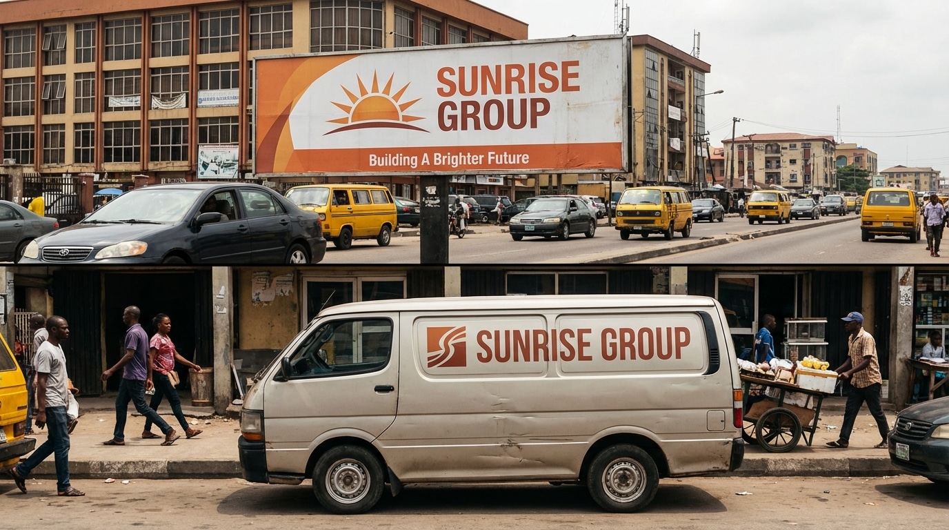
A customer sees your billboard on the way to work. That evening, they visit your Instagram page. The colours are different. The font feels unfamiliar. The tone does not quite match. For a fraction of a second, they wonder if it is even the same brand.
That fraction of a second is where brand recognition is lost. Losing recognition is a cost most brands cannot afford to ignore.
Why Brand Consistency on Billboards Matters More Than Most Nigerian Brands Realise
Brand recognition is built through repetition and coherence. Every time your audience sees your brand, whether on a billboard, a social media post, a product package, or a storefront, they are either reinforcing an existing mental association or starting from scratch.
When your billboard looks different from every other touchpoint your brand occupies, you are not reinforcing anything. You are fragmenting your audience’s perception of who you are.
Nigerian consumers are exposed to advertising from multiple channels simultaneously.
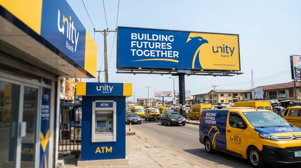
A brand that looks cohesive across all of them builds faster recognition, stronger recall, and ultimately more trust than one that treats each medium as a separate creative exercise.
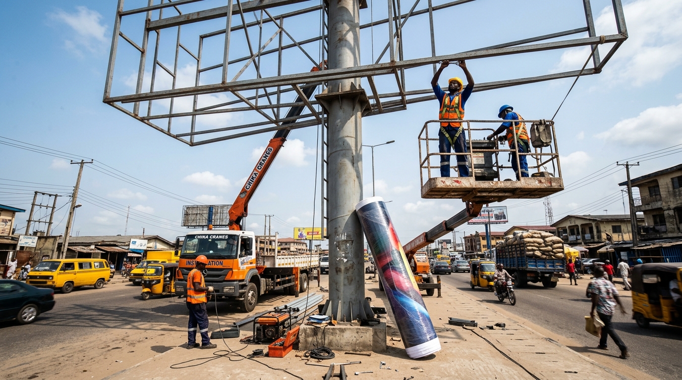
The billboard is not a standalone piece of artwork. It is one expression of a brand identity that should be immediately recognisable regardless of where it appears.
The Most Common Brand Consistency Failures on Nigerian Billboards
Before looking at how to get it right, it helps to understand where Nigerian brands most often get it wrong.
- Using different colours on the billboard than the brand’s official palette: This happens when a designer adjusts colours for visual impact without checking against the brand’s official colour codes, or when a printer’s calibration is not corrected before production.
- Choosing a font that looks bold outdoors but has no connection to the brand’s typography: A common shortcut that produces a visually strong billboard that feels entirely disconnected from the brand.
- Creating a billboard headline that sounds nothing like the brand’s voice: Formal brands that suddenly sound casual, or playful brands that turn stiff and corporate, confuse audiences who have already formed expectations.
- Placing the logo in an inconsistent position or at an inconsistent scale: Logo placement on a billboard should follow the same logic as every other brand application, with consistent, clear space and visual hierarchy.
- Using a completely different creative concept for the outdoor campaign than the one running on digital or print: Different concepts across channels can work strategically, but require deliberate integration. Most of the time, disconnected concepts simply look like different brands.
How to Make Your Billboard Match Your Brand Identity
Translating brand identity into billboard creative is not about reproducing your digital ads at a larger scale. Outdoor advertising has its own constraints, viewing distance, limited dwell time, and environmental context.
The goal is to apply your brand identity within those constraints, not to override them.
Here is how to do that systematically.
Start With Your Brand Guidelines, Not a Blank Canvas
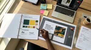
Every billboard brief should begin with your brand guidelines document open on the table.
If your brand does not have a formal guidelines document, create a one-page reference that covers your colour codes, approved typefaces, logo clear space rules, and tone of voice notes before briefing any designer.
Your billboard creative brief should explicitly reference which elements of the guidelines apply and how. Do not leave interpretation to the designer. The more specific your brief, the more consistent the output.
Use Your Brand Colours Without Compromise
Colour is the fastest and most reliable trigger for brand recognition. Research consistently shows that colour alone increases brand recognition by up to 80%.
On a billboard, where a passing driver has two to three seconds of exposure, colour is often the only brand signal that registers before everything else.
Your billboard must use your brand’s official colour codes, specifically the Pantone references or CMYK values defined in your guidelines, not approximations.
Work with your printer to ensure colour calibration is checked before production begins.
A billboard printed in the wrong shade of your brand colour is not a minor error. It is a recognition failure at scale.
Outdoor advertising also requires sufficient colour contrast between background and text for readability. If your brand colours do not naturally provide that contrast, your designer needs to solve the readability problem within the brand palette, not by stepping outside it.
Apply Your Brand Typography Correctly
Your brand typeface exists for a reason. It carries a visual personality that contributes to how audiences perceive the brand.
Using a different font on your billboard because it “looks stronger outdoors” undermines that personality and disconnects the outdoor creative from every other brand touchpoint.
If your primary brand typeface has a condensed or bold variant, use that for outdoor applications. If readability at distance is a genuine concern, discuss this with your designer before briefing, not after the artwork is produced.
In most cases, a brand’s approved typeface, applied at the correct weight and with sufficient size, performs well on outdoor formats.
Never introduce a new typeface on a billboard that does not appear in your brand guidelines. If a new typeface is genuinely needed, that is a brand guidelines decision, not a billboard design decision.
Keep Your Logo Placement Consistent
Your logo should appear in a consistent position on your billboard relative to your other brand communications.
This does not mean it must always be in the same corner of every format. It means the visual logic of how the logo relates to the other elements should feel familiar.
Follow your brand guidelines on minimum size, clear space, and approved colour variations. A logo that is too small to read at billboard scale, reversed out in an unapproved colour, or crowded by other elements defeats its own purpose.
Carry Your Brand Voice Into the Headline
Brand voice is not just a digital or print consideration. The tone of your billboard headline should sound like the same brand that writes your social media captions, your email subject lines, and your radio scripts.
A Nigerian fintech brand known for straightforward, no-nonsense communication should not suddenly produce a playful, pun-driven billboard headline because someone in the creative process thought it would stand out.
A heritage brand known for warmth and community should not produce a cold, transactional billboard message because the medium feels different.
Your billboard headline is a brand communication first and an advertising message second. Write it in your brand’s voice, then check that it is doing the advertising job it needs to do.
Maintain Visual Consistency Across Multiple Billboard Locations
If your campaign involves multiple billboard locations across different cities or road types, every board should look like it belongs to the same campaign. This means consistent use of the same artwork or a clearly unified campaign visual system across all placements.
Campaigns that use different artwork at different locations without a unifying visual logic fragment the campaign’s impact and reduce the cumulative brand recognition effect that multi-location outdoor advertising is designed to deliver.
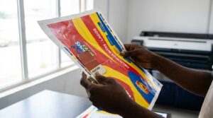
How to Brief Your Designer or Agency for a Brand-Consistent Billboard
A vague brief produces inconsistent creative. When briefing a designer or agency for your billboard campaign, always include:
- A copy of your brand guidelines or a condensed brand reference document
- The specific colour codes to use: Pantone, CMYK, and RGB, where relevant
- The approved typefaces and weights for outdoor use
- Logo file in the correct format for large-format printing, vector format only
- The campaign headline and any mandatory copy elements
- Examples of previous brand-consistent outdoor campaigns if they exist
- A clear statement of what the billboard must communicate and to whom
- The billboard specifications from the vendor: exact dimensions and file format requirements
The more complete your brief, the less room there is for creative decisions that drift from your brand identity.
What Happens When Your Billboard Does Not Match Your Brand
The consequences of brand inconsistency on a billboard are rarely immediate or dramatic. They accumulate quietly over time.
Audiences who see a disconnected billboard do not consciously register the inconsistency. But the mental association they should be building with your brand is not reinforced.
For Nigerian brands investing in billboard advertising to build or maintain market presence, this is not a theoretical risk.
A campaign budget spent on outdoor advertising that does not reinforce the brand’s existing identity is a campaign that achieves less than it should. Every naira spent on outdoor advertising should be working to build recognition, not dilute it.
Brand Consistency Checklist Before Your Billboard Goes to Print
Before approving your billboard artwork for production, run through this checklist:
- Official brand colour codes confirmed with the printer, not approximated
- Approved brand typeface used at the correct weight and size
- Logo in vector format, correct colour variation, with proper clear space
- Headline written in the brand’s tone of voice
- Overall visual feels consistent with recent brand communications across other channels
- Artwork reviewed against brand guidelines by someone with brand authority, not just the designer
- Scaled print test conducted and reviewed before full production
Conclusion
A billboard that does not look like your brand is not just a design problem. It is a recognition problem, a trust problem, and an investment problem. Every naira you spend putting an inconsistent billboard in front of Nigerian audiences is a naira that builds less than it should.
Brand consistency on outdoor advertising is not about being rigid or uncreative. It is about ensuring that every exposure your audience has to your brand, whether on a screen, a page, or a road, reinforces the same identity and builds toward the same recognition.
Start every billboard brief with your brand guidelines. Brief your designers against them specifically. Check every element before production. And treat your outdoor creative as an extension of your brand, not a departure from it.
Oxbillboards helps Nigerian brands find and book the right outdoor locations for their campaigns. The stronger and more consistent your creative is across those locations, the harder every board in your campaign works.
READ MORE:
How to Use QR Codes on Billboards in Nigeria
How to Own a Billboard in Nigeria
7 Budget Allocation Strategies for Billboard Advertising in Nigeria